The web site is often a first point of call when a client is seeking a designer. Your site should clearly state who you are, what you do and how to contact you.
. The site produced will represent you and your work using the appropriate skills to emphasise your work and your personality. You should consider carefully how you want to brand yourself and your identity as a designer. An understanding of web aesthetics is as essential as an understanding of web technology, therefore it is important that you research to gain a full understanding of conventions, limitations and the expectations of the audience.
Your site should be clear and considered (you have considered usability issues), but reflects yourpersonality (brand) – what is it you have to offer that no other designer has?
All sites must be online and fully web ready (including appropriate meta tags) before the deadline.
The first stage of this project was to look at recent websites to see what we like/ don't like about the navigation/aesthetics of websites around. I looked at a few just as a starting point such as:
Digital Kitchen
Which I thought had a great, simple homepage. I liked the cut out type on the grey background. Then when you click the boxes come up and you can either click on those or the list to show the work. The only thing I found strange was the list was on the right and is normally on the left. Easy to navigate and use.
Good Is Dead
Though I thought this was easy to use by clicking on a link, aestheticaaly I didn't think it was pleasing.
Graphical House
Presentation wise very easy, consistant in style with bars, list in bars ordered easy to use. Then box comes up with the work.
A website I looked at whilst doing my research was one by Spencer Wilson a really ace website that I thought would be good to base my website on- use all the same functions (drag and drop) would be nice and simple to do.As I don't want my website to be too complex.
The first thing I had to come up with was my identity- my brand. My initial idea was to be "Organised Chaos", as generally thats how I work. So I first looked at type I could use:

After this I choose my type and looked at colour:

I choose the pink type as i thought this worked the best, but I did quite like the light green one. After having chosen the type and colour. I then looked at designing the website. I tried to use a consistant style and worked with the colours. I first looked at the homepage, lookng at different ways it could be laid out, but I didn't change to too much per test, Then I did the same to where the work would be presented. I also looked at the Contact and Links. Looking at the Links I changed/reversed the colours in the box which I think worked better as it makes the type stand out more.


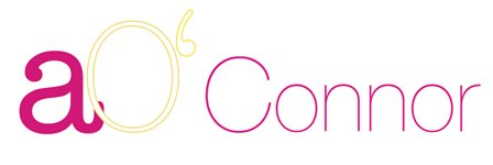
The next day I had a crit with Neil and a few of my class mates. The main comment was about the name, Neil made a good comment that if he was to hire a Graphic Designer if he saw Organised chaos that he wouldn't get a good impression just by the name. Another comment that the type looked organic I had used American Typewriter, and when they ade that comment I agreed. I said one of the thigs I didn't like was my name for an identity. Neil thought that using simply my first name might be the best identity name as there is so much I could do with it. So I then looked into different ways of graphically representing my name.


For the identity anna I looked at different ways I could show the name keeping the same colour. I thought about the a more how I could arrange that. When I came up with my logo choosing my final layout I looked at colour(Like when I chose the type) and looked at combining two typefaces making one letter bigger than the other etc. I think overall it works quite well, I think some people could be confused that its anna, but I was thinking aa as its the first and last letter in the name.
Refering back to the Organised Chaos identity, a lot of people said that I should have made the organised look quite neat and then the chaos messy, or that type should be all different sizes.

No comments:
Post a Comment